PROJECT: Issue 17 Update 7
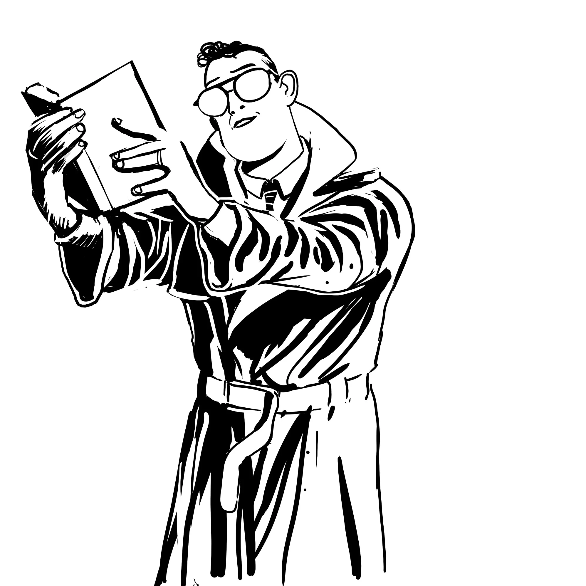
So, what am I doing here? The original script for issue 17 of Sandman was reprinted in the back of the trade paperback Dream Country and I used to think… What if I drew that. So, here I am drawing, lettering, colouring the whole issue as though the original script was written for me, rather than the original (and brilliant) artist Kelley Jones. This is “Issue 17”. Wish me luck.

Good luck to everyone dealing with the fallout from Covid-19, I hope you’re safe, well fed, and not destitute because of it.
Thanks for coming to my site. There is a infinite amount of content on the internet so I'm honored that you parked your seat here for a bit. So, what am I doing? The original script for issue 17 of Sandman was reprinted in the back of the trade paperback Dream Country in 1990 and I used to think… What if I drew that myself? So, here I am now drawing, lettering, and colouring the whole issue as though the original script was written for me, rather than the brilliant Kelley Jones. This blog will keep you updated to my progress till its done. This is “Issue 17”. Wish me luck.
Colour and Letters
I’ve heard the old adage, I think from Neal Adams, that style is “the things you get wrong”. I think that’s mostly true, BUT — I feel sometimes that style is better understood as “the things you can’t help but get wrong”. My approach to colour seems to bear that out. I can’t help but fuck it up sometimes.
And as for lettering? Well, I learned a valuable lesson, LETTER AS YOU DRAW. At least rough it in. While I was lettering the pages I realized in many places that I didn’t leave enough room for the word bubbles. So stupid of me, and Neil Gaiman writes a LOT of text in his balloons. So I spent a good deal of time resizing the art to fix my mistakes. Thank you Photoshop.
The Plan is still to post the entire comic for free online. And if there is any sort of demand do a small print run with any proceeds going to charity.
Below are a selection of finished pages.
Page 1

Page 2

Page 3

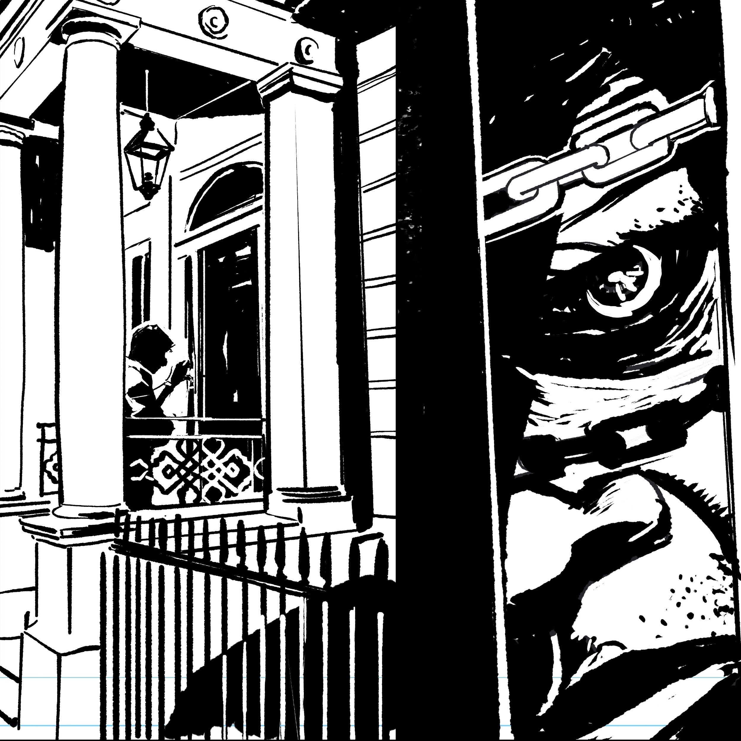
Page 7
Page 16

Pagw 18

Cover
PROJECT: Issue 17 Update 6

Thanks for coming to my site. There is a infinite amount of content on the internet so I'm honored that you parked your seat here for a bit. Now listen to this, I am recreating all of issue 17 of Neil Gaiman’s Sandman. The original script for issue 17 has been reprinted in the back of the trade paperback Dream Country many times. I am drawing, lettering, colouring the whole book as though the original script was written for me, rather than the original artist (and brilliant) Kelley Jones. This is “Issue 17”.
Some people might balk at the thought of taking a year to draw twenty four pages of a black and white comic, I am apparently not one of those people. I do have a full time job making video games and my wife and I did have a beautiful baby girl so I have been a little busy…
That being established, I only have a few more pages to go and then I'm off to colours (which I'll have some assistance with from my friend David Theron) and I become a man of letters.

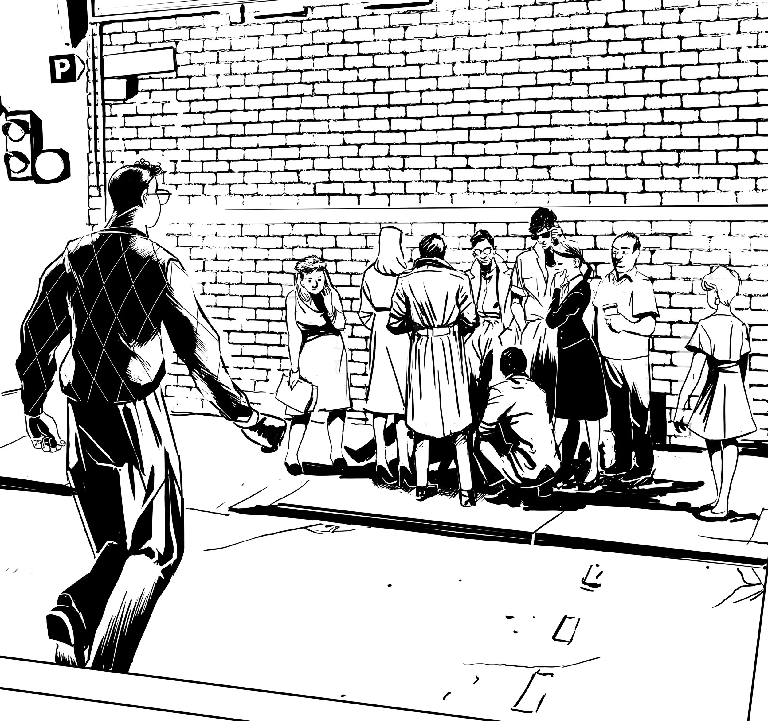
Page 03

Page 07

Page 10

Page 12

Page 13

Page 22
PROJECT: Issue 17. Update 5

Thanks for coming to my site. There is a infinite amount of content on the internet so I'm honored that you parked your seat here for a bit. Now listen to this, I am recreating all of issue 17 of Neil Gaiman’s Sandman. The original script for issue 17 has been reprinted in the back of the trade paperback Dream Country many times. I am drawing, lettering, colouring the whole book as though the original script was written for me, rather than the original artist (and brilliant) Kelley Jones. This is “Issue 17”.

Page 15
All this Sandman news
It’s been a very strange time to be a Sandman fan. Although Sandman has never really disappeared from the consciousness of fans over the years, news stories of interest to the wider culture are rare. Last week it was announced that Vertigo comics, Sandman’s publisher was closing down after a stint of dwindling sales and lost direction probably due to Karen Berger’s absence. DC will replace Vertigo with the already disappointing Black Label, who’s name sounds like a cheap ice beer.
Now this week it was reported that Sandman is getting a “high budget” streaming series on Netflix produced by the man himself, Mr Gaiman and some other talented fellows.
Although Vertigo’s influence is titanic on comics in the 90’s and its successive generations, as of late, Vertigo’s impact has been small. I feel a twinged of sadness a its passing, but considering it’s history is inextricably linked to that of Sandman. Let’s hope it might live on a bit when the dream king streams to a new generation of curious readers with the Netflix series. Albeit not through its original imprint but through the foggy dew of the Black Label.
The Pages
I have two new pages this week. My talented friend David Theron said that they’re good, so I’m going to take his word for it. I’ve been enjoying this project so far. I only have 10 pages left to draw.

Page 14
If you like what you see here please drop me a line, comment, do whatever you need to do to say hi. I would love to hear from you.
PROJECT: Issue 17. Update 4.

Thanks for coming to my site. There is a wicked amount of content on the internet so I'm honoured that you parked your butt here for a bit. I am recreating all of issue 17 of Neil Gaiman’s Sandman. The original script for issue 17 has been reprinted in the back of the trade paperback Dream Country many times. I am drawing, lettering, colouring the whole book as though the original script was written for me, rather than the original artist Kelley Jones. This is “Issue 17”.

Page 4
So. This is page 4,5 & 24. I'm not going to pretend that I'm the most creative person on the planet. This is how I keep track of the images I draw from for inspiration and art direction. I keep a Pinterest board for the entire project. I use that to catalog all of the images I find on Google or my personal favorite search engine Bing. I would hazardous to guess that Bing is the best place to find images for your drawings or duckduckgo
But why is that?
In the pursuit of authenticity I like to research my drawings and the internet makes that easier these days. But I fear that this is a really limited way to find an authentic experience… I work as an art director and we always have tight deadlines. So artist will often simply use Google to find an idea. It's search engine creativity. Of course, it makes sense. It's fast, but I think that as an artist it's your job to find images and inspiration that are fresh and different. So I like to get out when I can and see the world. I'm really lucky because I live in Toronto and it has all sorts of location that could be almost anywhere on Earth. Lots of movies are shot here, so if I need a castle I can go to Casa Loma (the original X-mansion), if I need a New York street its there. And if I need something set in Toronto I have Toronto. But no one ever wants to set things in Toronto. I could even go to the zoo and take pictures of the beasts if I wanted to. But most of the time I just sit at my PC and Bing it or “duckduckgo it”, because at the very least, they are not the world's most popular search engine…

Page 5

Page 24
PROJECT: Issue 17. Update 3

I am recreating all of issue 17 of Neil Gaiman’s Sandman. The original script for issue 17 was reprinted in the back of the trade paperback Dream Country. I am drawing, lettering, colouring the whole book as though the original script was written for me. This is project “Issue 17”.
Here is an update for the Issue 17 project. This is page 11 and I’m pretty HAPPY with this page. Also I think I did my favorite panel of all time on Panel 1 Row 2. It’s so Daniel Clowes from “Like a velvet glove cast in iron.”

Page 11
The day I finished this is also the day that we had a chemical smell radiating in our bathroom, which led to the police, fire department, ambulance and seemingly every other emergency service above, below and on earth come over. Nice people all around.


Page 11 Rough 02
Look at how bad my sketches are… Wow.

Page 11 Rough 01
PROJECT: Issue 17. Update 2

I am recreating all of issue 17 of Neil Gaiman’s Sandman. The original script for issue 17 was reprinted in the back of the trade paperback Dream Country. I am drawing, lettering, colouring the whole book as though the original script was written for me. This is project “Issue 17”.
I just finished page 20. I’ve included two pages of my roughs so those of you obsessed with process (much like myself.) can enjoy how badly I draw.


PROJECT: Issue 17. Update 1

I’m about 1/3 of my way through a rather large comic book project that I’m currently calling Issue 17 or maybe I’ll call it FanFiction. I don’t know yet.
BUT let me tell you what's up.
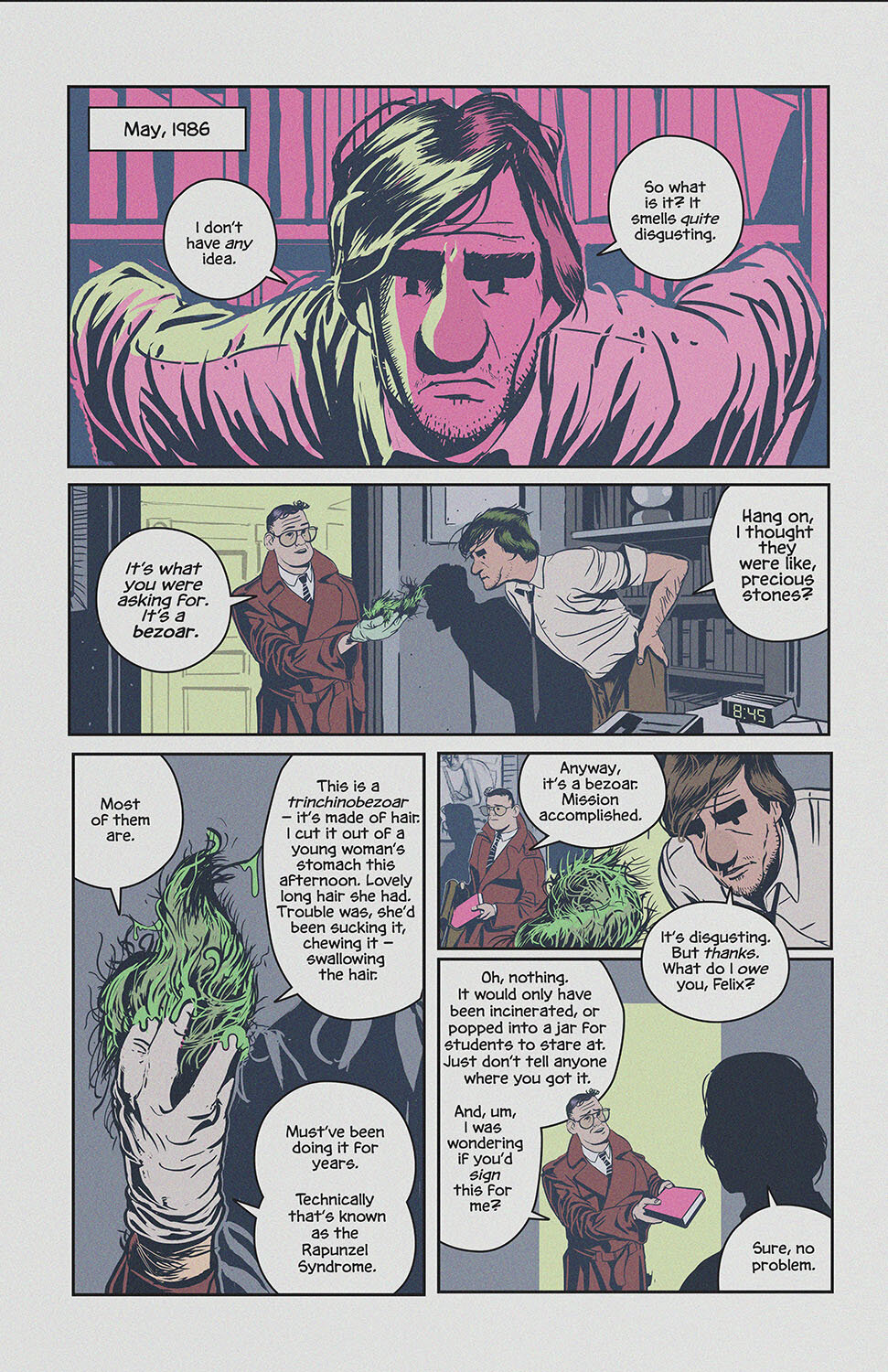
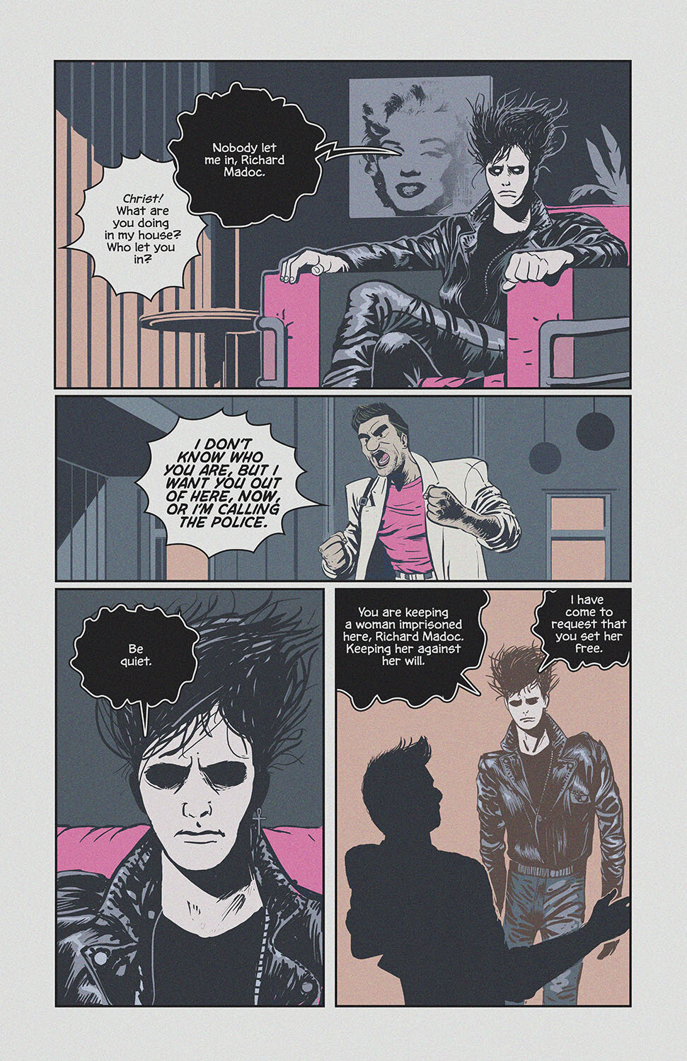
I am recreating all of issue 17 of Sandman which was originally written by Neil Gaiman and drawn by Kelley Jones and Malcolm Jones in the '90s. This issue titled “Calliope” is about a hack writer who conspires to keep the Muse of the famed storyteller Homer captive in his attic, and was originally printed in July 1990 by DC Vertigo and reprinted numerous times since then in the trade paperback Dream Country. Stuck in the back of each of these reprints is the original script for issue 17.

Mr. Gaiman would write these scripts as a kind of letter to the artist. In this case it was to Kelley Jones. It’s a fascinating read, and gives a deep insight into the process of making comics by two master practitioners of the medium. So, being an artist of sorts myself I intend to redraw this book from the original script as though it was written to me rather than the incomparable Kelley Jones, this is the fan fiction part.

I plan to do the project in about three phases. This is all about pretending to be a comic book pro, so I’m going create a facsimile of the classic western method of making a comic book. TRIED AND TRUE. First I have blocked out/thumbnailed the script into drawings and then… I will draw all the pages out as I see fit. I’m going to cherry pick each of the pages, drawn them, then letter and colour said pages. In the end I plan to do a limited print run of the book through kickstarter or whatnot and have a local art show In Toronto for good measure.
Hopefully I'll learn a thing or two about sequential storytelling along the way and the next original comics I do will be better.
Drop by here for updates.
Here is what I have so far…

Page 1

Page 2

Page 6

Page 8

Page 9

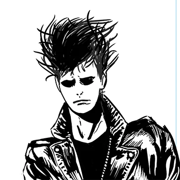
Page 16

Page 17
PROJECT: The Vigilants of Astragoth

This is an update to a project I'm working on...
I'm finished the Vigilants of Astragoth picture and in the end I'm pretty happy with the how its turned out. As is my brother, who will be pressing a vinyl record with the image I created for the cover. It will be a cacophony of madness. Here are some other little tidbits about the project.

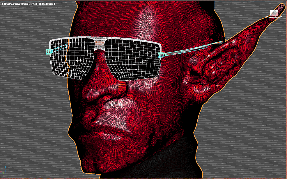
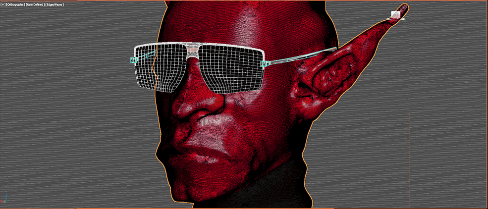
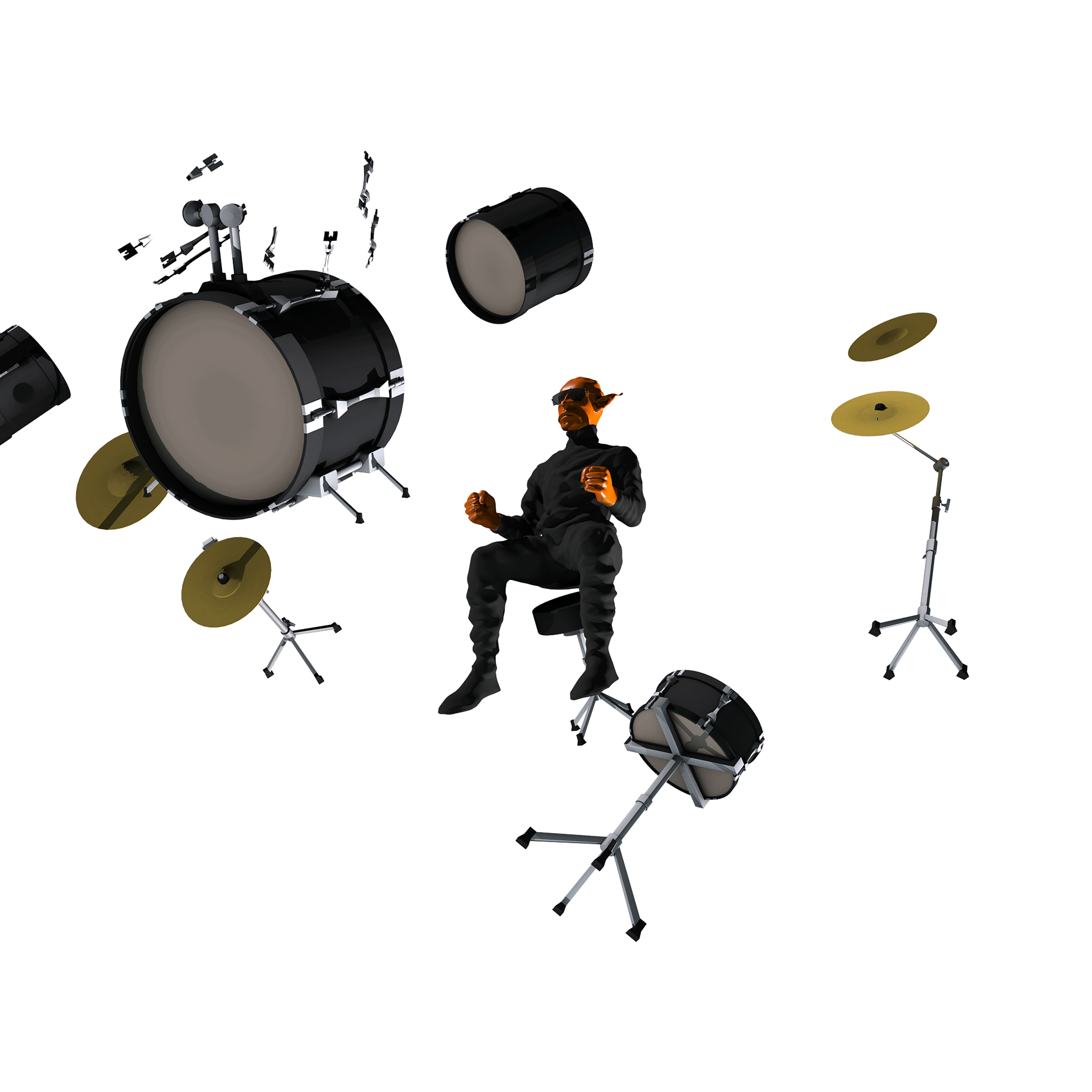
If you take a gander at the above image, you will spy a little into the process. I've been inspired by a lot of illustrators who have been photobashing their pictures. This means that I will be mixing 3D renders, photos, and digital painting together to get the final result. In my opinion, it's closer to collage than digital painting; once you go digital the lines all begin to blur.
To do the photobashing, I began the whole process in black and white. That way I only had to worry about creating a sense of realism with tonality and then bring the colour back afterwards. I rendered the drums and the character in 3Ds Max. I then went across the street from my apartment and took some pictures of the demolition next door. I used those pictures at the bottom of the illustration to suggest homes are being ripped apart by the growing storm.

I also took this picture of our neighborhood..

Howard the duck (copyright Walt Disney)
As for the storm, I decided to have some dramatic clouds with an eye of Sauron kind of demon presence in the background. I remembered a scene from Howard the Duck that was pretty much perfect. If you haven't seen that movie you should watch it sometime soon. It's not very good. But you should watch it. I found it on YouTube and took a screen grab with the Windows snipping tool.

Howard the duck (copyright Walt Disney)
So "borrowing" images from the internet isn't the postmodern heaven its cracked up to be. I couldn't use the image because it was too small, thus pixelated. Just look at how compressed that image is! I had to repaint pretty much the whole thing. Which wasn't the end of world for myself because I was beginning to feel weird about painting so little.

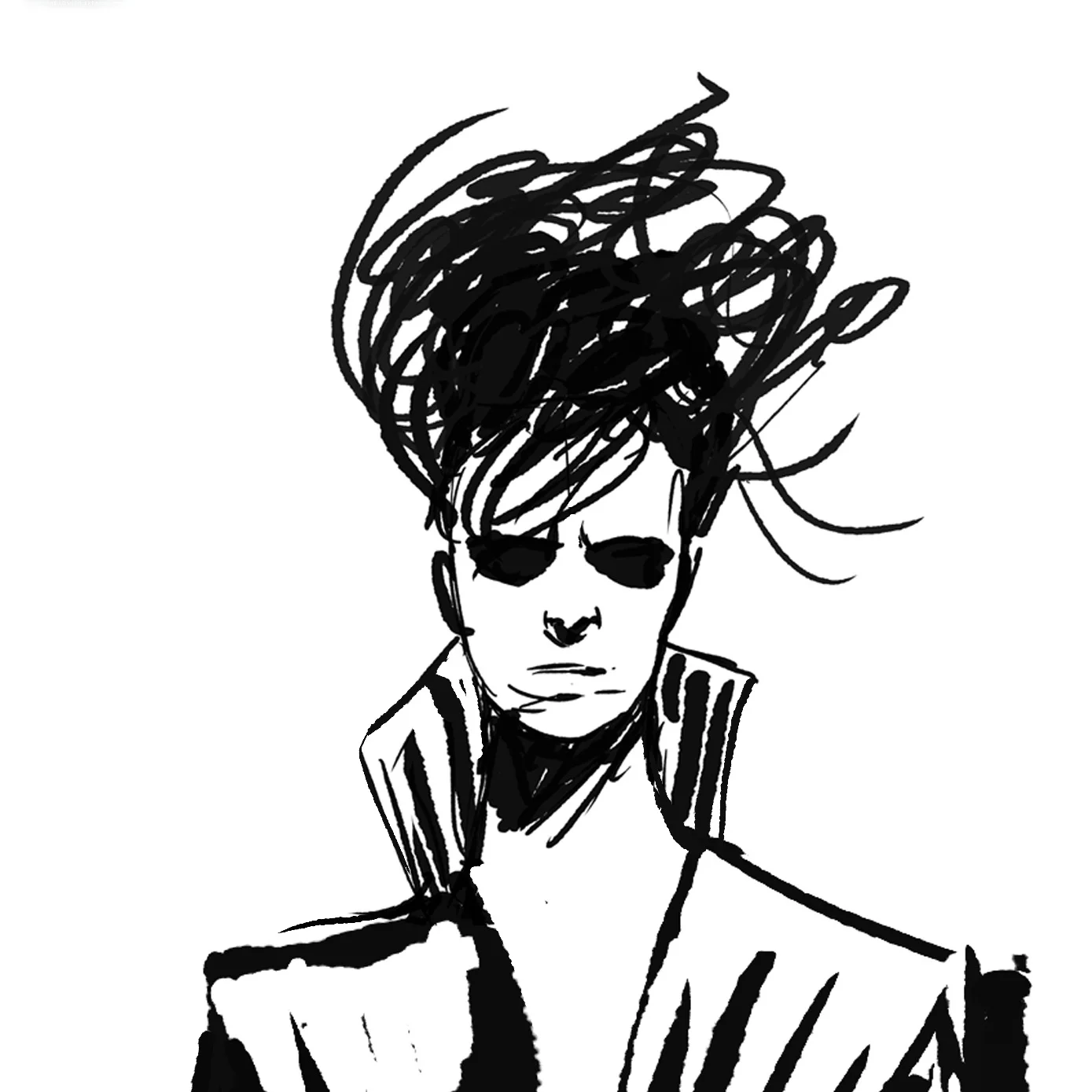
Bump Fugget, The evil eye of Astragoth, Air Jordan 6's (the ones in red and black.)
I ended up painting a lot of the details in Bump Fugget's body in general, including his Air Jordan 6s (the ones in red and black.) Those fucking shoes.
Like I said before I also repainted the storm and the eye that goes with it. The eye went through three variations. One was a fiery blaze but it looked TOO MUCH like the eye of Sauron. This isn't fan art. The second variation isn't worth mentioning and this last one was based on a reptile eye.
Since I'm photobashing most of this illustration the painter in me feels like I'm cheating. But after some soul searching I've come to the conclusion that the act of painting isn't what's important at all. If the execution feels seamless that's whats really important at the end of the day. Does it feel like it has that Magic!

The final image.
Finally for the logo I did a tutorial by Craig at Spoon Graphics of "How To Create an 80's Style Chrome Logo Text Effect in Photoshop" which you can see here. The font treatment makes the whole thing.
I wonder though, Is the final piece working? I think there is a lot of room for improvement.
I want to know: does the final image have a little bit of that gawd damn magic?
PROJECT: Vigilants of Astragoth
This is an update to a project I'm working on at the moment...
Recently we managed to get my lovely girlfriend Karen's record player working and because I'm a big fat old hipster I now love records. The vinyl record is back in full force and even my recalcitrant brother David is into it. He has this band, an art project really, called "VIGILANTS OF ASTRAGOTH." Listening to VofA is kind of like looking into the Arc of the covenant. It will melt your face off.
I asked him if I could make a cover for his first record and he said yes. So I'm off to work on it.
Maybe you don't know this but I work as a video game artist. They call me an art director, I draw a lot. But I also use 3D applications and I've always wanted to improve my Zbrush skills. If you don't know Zbrush is a 3D sculpting program. It's mighty powerful and my aptitude in it is not up to the level of my digital painting. So I want to improve. VofA will help me get there.
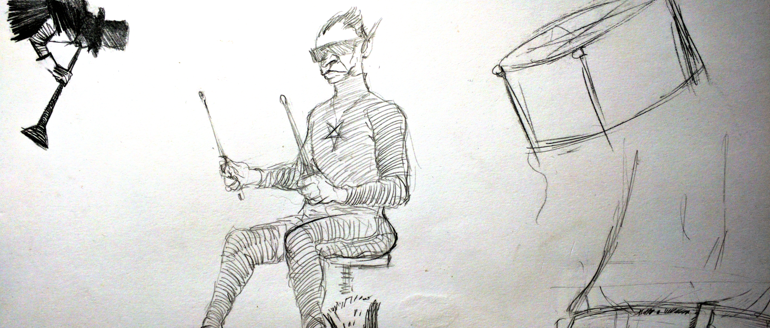
I've done a bunch of drawings to see what I want to achieve with this thing and I made an image of what Bump Fugget, VofA's front man, looks like. Bump Fugget is half goblin. As in he's the by-product of a human and a goblin bumping (f)uglies in the night. My brother is fucking weird, but he's more interesting than almost everyone.
I don't intend for the final image to be all in 3D but I think I have a cool compostition in the making and use the 3D sculpt in two ways. For lighting and positioning. I'll do the rest of the work in Photoshop. I remember Todd McFarlane said that when he started making comics he used good design as a way to mask his short comings as a draftsman. So I don't mind using the same technique to get better at Zbrush.
I managed to get a rough sculpt out of Zbrush that I don't totally hate. I don't think the details will hold up to the close scrutiny of a close-up camera, so I'm going to push him back into space and use the design to my advantage. I think I can do more of the heavy lifting in the digital painting. I'll improve on the Zbrush skills in the next project. You know... baby steps.
Hi I’m John Little, Father, Husband, Artist, Game Designer, and Graphic Novelist. I’m a busy man.
My first published Graphic Novel, The Salesman can be read for free by clicking the link above.
My new collaborative project SUPER CODE STRIKE with the team at Creatubbles will be reaching open BETA soon.
Currently I am plugging away at a recreation of Issue 17 of Neil Gaiman’s SANDMAN. After which I will be producing some short stories.
Thanks for reading my blog and maybe even… Being a fan.